Understanding Cost Models
11 May 2020The dominant way modern query planners decide what algorithms to use for a given query is via a cost model. Effectively, they enumerate the set of possible plans for a query, and then run their cost model over each one, eventually returning whichever one had the cheapest cost according to the model.
Analytic queries can become complex, horrifically so, in fact, and assessing their costs follows suit. To alleviate this somewhat, we’re going to explore some tools we can use to attempt to travel up the ladder of abstraction for query planners. In doing so, we’re going to try to figure out where the difficulty here lives: is looking at a single query confusing because we have the wrong perspective, or is there some inherent complexity present here?
Consider the following query:
SELECT * FROM t WHERE x = 3 ORDER BY y
Where we have two indexes on t, one on x (X) and one on y (Y),
and we can read either one to get all the columns we need (they’re both covering).
We can service this query in two ways:
- Scan
X(which allows us to quickly find rows havingx = 3), restricted tox = 3, then sort the result, or - scan
Y(which gives us the result ordered ony), filtering out rows not havingx = 3.
Which is better? To figure that out, let’s consider two parameters that dictate the shape of our data and the behaviour of these two alternatives:
- \(s\) (for selectivity), the proportion of rows in
tmatching the condition, and - \(c\) (for cardinality), the total number of rows in the table.
(One thing that’s slightly confusing but important to keep in mind is that we define selectivity as “output size divided by input size.” This means that a more selective predicate has lower selectivity, and vice versa.)
We need to pick some cost-unit constants, whose actual values are not particularly important:
- \(q_1\) is the cost of scanning a single row.
- \(q_2\) is the constant factor on the cost of a sort (i.e., times \(n\log n\)).
- \(q_3\) is the cost of emitting a row from a filter.
We can then cost these two alternatives for a given situation.
The cost of scanning X then sorting is given by:
\[
C_X(s,c) = q_1sc + q_2sc\log(sc)
\]
and the cost of scanning Y then filtering is:
\[
C_Y(s,c) = q_1c + q_3sc
\]
Whether we can choose good values for the \(q\)s is a question for another day. For now, assume I chose them in some intelligent way (I didn’t).
To get a feel for how these two cost functions behave, we might fix either \(s\) or \(c\).
First, try fixing \(c\). There are no units because I want you to just focus on the shapes of the curves.
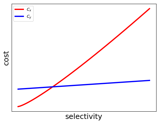
The intuition behind this graph is that as the selectivity gets higher, our seek ends up encompassing more and more of the table, and the cost of the sort begins to dominate the gains we got by skipping over some data.
This is a very common pattern that comes up when comparing cost functions:
- one alternative that starts at zero and scales very quickly, and
- one alternative that starts fairly high and scales much more slowly.
This dilemma is often characterized as a “risky” choice, which is very sensitive to changes in selectivity, vs. the “safe” choice, which is very insensitive to such changes. We might like to reduce risk and always choose the blue line, but the reality is that the vast majority of cases in common workloads live at the very far left of this graph, and so that’s not a reasonable option.
Then, try fixing \(s\):
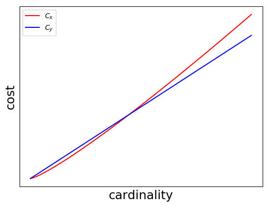
We can interpret this one as: at sufficiently high cardinality (which is not all that high), the selectivity has to be quite high to make a full table scan worthwhile.
Both these graphs help us understand the behaviour of our implementations at a fixed cardinality or selectivity, but what we’d really like is a more complete picture of how the cost models behave. We could plot them in 3D space, but I don’t really understand how to use matplotlib very well, so we’ll have to find another way.
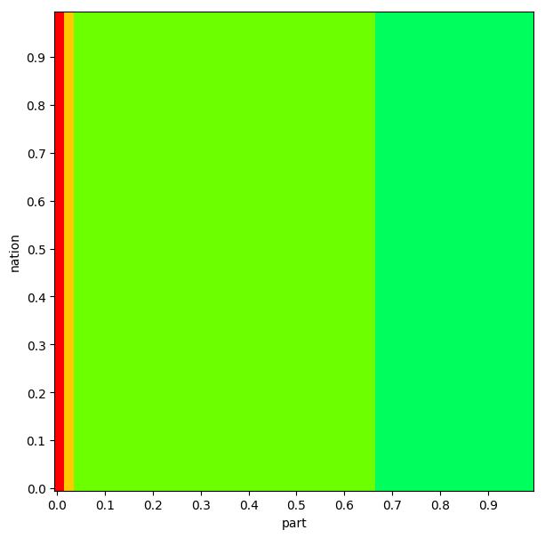
Thankfully, what’s noteworthy about these plots in particular is that we actually don’t even need the full fidelty of a 3D plot. The only relevant thing for our decision is whether we choose the red plan or the blue plan. We might be curious about the behaviour beyond that, but our query planner is going to slap a big ol' “WHO CARES” on every other piece of information this graph contains. So what if we only plot that?
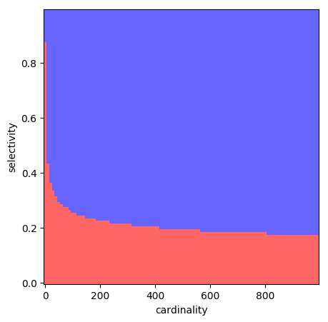
Each square in this 100x100 grid represents a point in the selectivity/cardinality space. We colour a point red if we estimate the red plan to be better at the point, and blue if we estimate the blue plan to be better. This is a super lossy way of looking at our cost models, but nonetheless it gives us a feel for what the space looks like.
This is what’s known as a “plan diagram,” and to my knowledge they were first introduced in Analyzing Plan Diagrams of Database Query Optimizers by Reddy and Haritsa.
I think these are cool because they let us use visual noisiness as a kind of proxy for the level of complexity that the planner sees in the plan space.
One particularly cool thing about plan diagrams is that they only require us to know the assessed best option at any given point, and not the actual estimated cost of each option.
As it happens, a query planner is precisely a tool that is eager to tell us its opinion on such matters! Of course, a real query planner will be considering far (far) more than just two alternatives, and so it’s a bit tricky to get the idealized scenario described above with a real query planner, but it’s actually quite easy to look at some (sort of) practical examples.
TPC-H
TPC-H is a “decision support benchmark,” which basically means it’s a collection of big, complicated queries with lots of planning dilemmas. It represents a handful of tables a business might have, along with a set of queries representing questions that business might have about its data.
Here’s TPC-H query 18:
select
  c_name, c_custkey, o_orderkey, o_orderdate,
  o_totalprice, sum(l_quantity)
from
  customer, orders, lineitem
where
  o_orderkey in (
    select l_orderkey from lineitem
    group by l_orderkey having sum(l_quantity) > 300
  )
  and c_custkey = o_custkey
  and o_orderkey = l_orderkey
group by
  c_name, c_custkey, o_orderkey, o_orderdate, o_totalprice
order by
  o_totalprice desc, o_orderdate;
Since most of the relations in the TPC-H tables have an integer primary key, we
can control the selectivity over any given relation by tacking on an extra
predicate.
TPC-H has a configurable scale-factor that determines how much data it uses,
at scale-factor 1 (what I’m using), the customer table has 150000 records.
So if we add a predicate of c_custkey < 150000*s, we can
artificially modify the size of the customer relation by selectivity s.
I plugged the resulting query into Postgres along with EXPLAIN to see what
it’s going to do with the query.
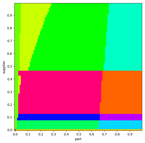
We’ll do the same thing as above: colour each square corresponding to the same plan the same colour.
By doing this for two relations, one along each axis, we can create a plan
diagram with selectivity for each relation along each axis.
This is a pretty simple idea, but we can get some pretty stunning results:
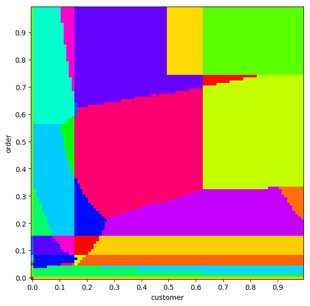
Remember the colours themselves are not significant. If two squares are the same colour, that just means that they have the same plan.
Sometimes, we can see which relations the planner thinks are not important:
By doing this we can often see some pretty beautiful patterns. We can inspect some other queries too.
This plot of TPC-H Query 2, I think looks “healthy,” in that there’s no weird jumping around or things that look especially discontinuous:
Conversely, this plan diagram hints at some problems (though we can’t know for sure without inspecting those plans further):
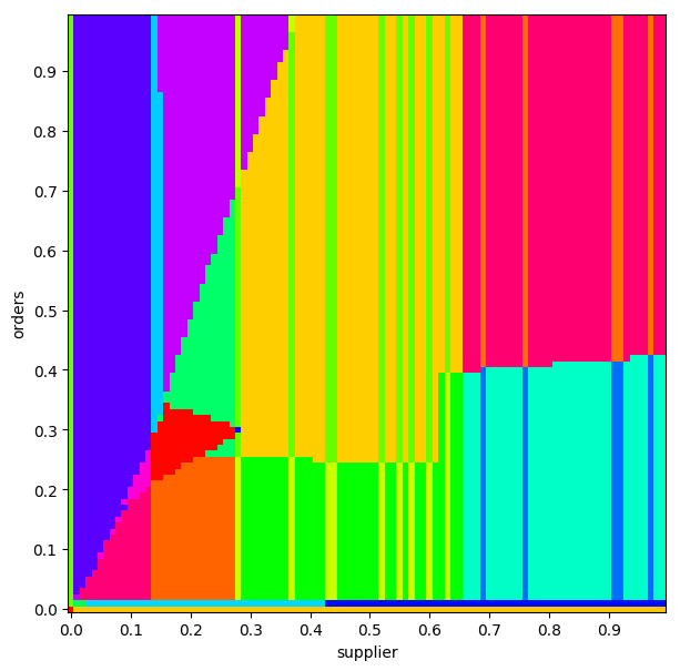
None of the analysis I’m doing here is scientific, by the way. The paper that discusses these diagrams talks about specific observations we can make that indicate problems, but I’m mostly interested in them as a venue for getting a bird’s-eye-view of some planner behaviour.
Looking from the outside in, it’s hard to see much actionable about these, but I think there’s two things we can take away from these diagrams:
- Look at the complexity! No matter what tack you take, I think the crazy nature of these plots indicates that you’re going to find it challenging to wrap your head around what the planner is doing.
- For a practitioner, we have some insight about where we might poke around for problems. One wouldn’t expect costs to be particularly discontinuous, so regions in the plan diagrams where the plan changes frequently are pretty suspicious.
But… that’s an interesting question, actually. Are costs pretty continuous, at least as the planner sees them? Since the Postgres planner also reports its estimated cost for a plan, we can check that too. Based on some quick investigation, it definitely looks like there’s some discontinuity going on. And here’s a plot of various estimated costs:
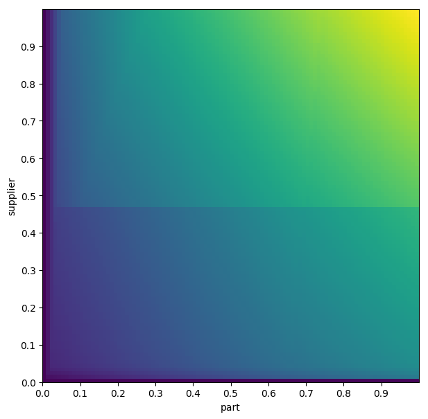
There’s probably an interesting investigation to be done about the continuity of cost functions, and where the strange blip in the middle comes from, but I think that’s a question for another day.
I don’t have much more to say about these plots, besides the fact that I think they’re cool and a useful tool to have in your back pocket.
For me, the core takeaway is the complexity they make clear: Postgres is regarded as a pretty competently-made database, and even it has plan diagrams that are indistinguishable from chaos. As your database begins to reach maturity and your number of customers rises above one, the number of safe improvements you can make to your cost-model tends to zero very rapidly, every change breaks someone’s workflow.
When I first learned that Oracle allows users to revert the behaviour of their query planner to ~any earlier version I was horrified. Shouldn’t we, as implementors, be striving to always make things better? I really saw this as throwing in the towel: an admission that none of us really have any idea what we’re doing here. In the time since then my opinion has shifted pretty substantially. When I learned that Spanner recently adopted this methodology as well, my reaction was “yup, makes sense.” With some time away to reflect on it, were I still at Cockroach Labs I think I’d be pushing for that same change to be made in CockroachDB in the near future*.
The reason for the shift in my mindset is twofold.
First, I think I’m starting to fully grasp the complexity we’re wrangling here. It’s easy to argue that we could build a simpler cost model that doesn’t defy human understanding, and that’s true! But I promise you that when your simpler cost model hits customer workloads there will be a reckoning in one direction or another. We could also throw in the towel in the other direction: if this problem is so intractable, why are we building these massive jenga towers of estimations? I think that’s a reasonable position to take too, though it’s one I’ve argued against in the past.
Second is the assymmetry present in the planner’s relationship with customers. None of your customers are going to call you up and offer you more money because the new version of your software ran their query 15% faster, but they will complain if your change made their query even a hair slower. This creates a tendency to fear change: if a change to the planner causes 99% of affected queries to run incrementally faster and 1% to incrementally slow down, that’s a bad change, and if I’m the one bashing on the keyboard to bring it about, the absolute best outcome is that nobody complains. But this kind of incremental change, over time, is how you make a planner robust, and how you slowly dig it out of local maxima. Basically, you have to be able to make Pareto-inefficient changes, and permitting your customers to insulate themselves from those changes is how you make them safely.
Where does this leave us? I think unfortunately more-or-less at the same place we started, but hopefully a little wiser: a cost model is effectively a set of beliefs your software holds about the real-world. Sometimes they will be wrong. Or right! Or wrong in one case, and right in another. Or right today, and wrong tomorrow.
Thanks Ilia, Ruchir, Natacha, Irfan, and Paul for their early comments on this post!
* This is not a decision to take lightly: you're probably going to end up just copy-and-pasting large swathes of code to make this work, so you better be _very_ confident in your interfaces when you do it.